
Power Bank Packaging Strategy: What the Front of the Box Must Explain in 5 Seconds
A private-label buyer framework for deciding which messages deserve the front panel—and which details should move to the side or back.
“The product had five selling points. The front of the box communicated none of them clearly.”
That is how packaging becomes decoration instead of merchandising. The shopper should not need to rotate the box three times to discover whether the product is 10K, 35W, magnetic, built-in cable or designed for travel.
A stronger front panel answers one question quickly: what is this product, and why should I pick this version instead of the one beside it?
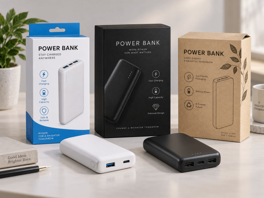
Design the Front Panel for a Five-Second Decision
- Lead with product type and the one convenience feature that defines the SKU.
- Capacity and charging power should be visible, but they should not compete with every secondary specification.
- Built-in cable, magnetic, direct-plug and high-power products need different front-panel priorities.
- The back panel should carry technical detail, legal information and secondary compatibility notes—not the main reason to buy.
A Five-Second Packaging Hierarchy
The exact order can change by channel, but a useful private-label starting point is to make these five layers easy to scan.
Public Packaging References: What Buyers Can Study
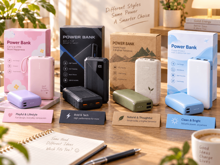
Retail packaging is useful evidence for studying information hierarchy, icon density, product photography and how a brand explains the SKU. It does not by itself prove sell-through, margin or who manufactured the product.
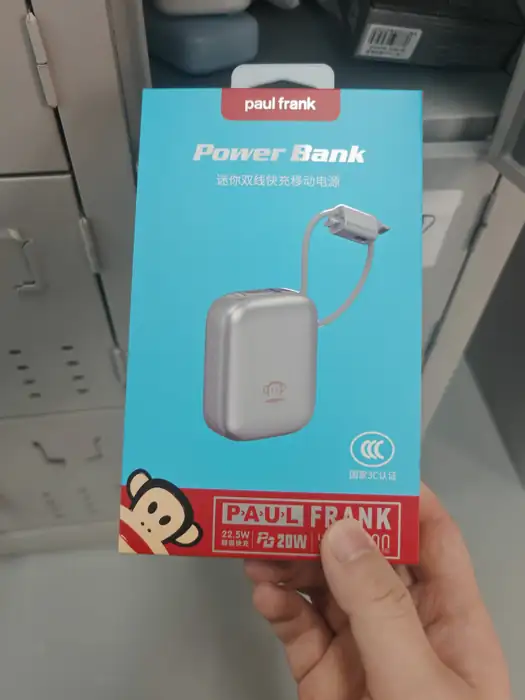
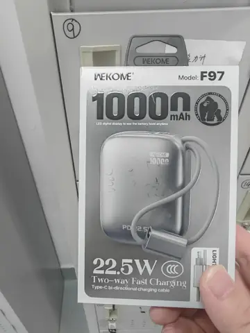
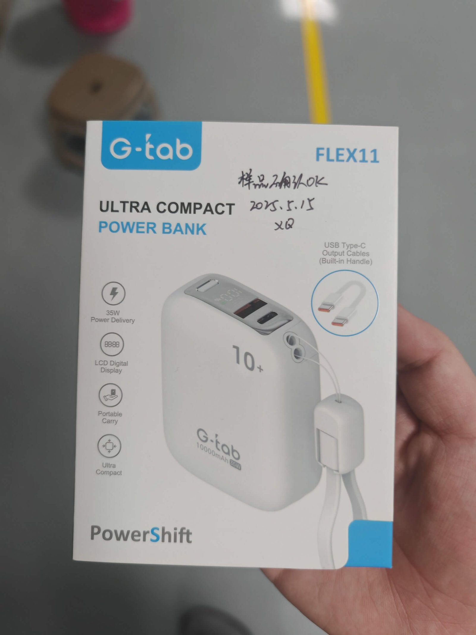

Front Panel vs Side and Back Panel
| Panel | What should usually live there | What to avoid |
|---|---|---|
| Front | Product image, category, capacity, power and one primary convenience feature | Dense protocol lists, long compatibility paragraphs and too many icons |
| Side | Secondary features, cable types, dimensions, colour or quick icon system | Repeating the exact same front-panel content |
| Back | Technical specification table, I/O profiles, model information, warnings and required legal text | Hiding the main purchase reason here |
| Inner / insert | Instructions, fuller compatibility notes, support information and product-specific guidance | Using the insert to rescue unclear retail packaging |
Different Product Formats Need Different Front-Panel Priorities
Built-in cable
Make the integrated-cable benefit visible immediately. The shopper should not have to inspect the product photo closely to understand that no separate cable is required for the main use case.
Magnetic
Magnetic attachment, wireless-charging scope and wired backup should be separated clearly. Do not let a magnetic visual imply a certification or charging mode that has not been verified for the exact SKU.
Mini direct-plug
The connector format and pocketable use case should carry more weight than a long feature list. The visual should make it obvious how the product connects to the phone.
High-power PD
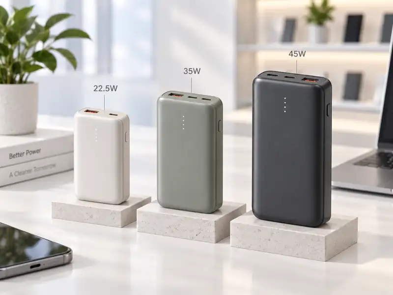
Power matters more here, but the box should still connect the wattage to a use case. A large “45W” is more useful when the rest of the panel explains the intended USB-C device role.
Packaging Review Checklist Before Artwork Lock
- Can a buyer identify the product type in one glance?
- Can they find capacity and charging power without reading fine print?
- Is the main convenience feature visible from the front?
- Does every icon represent a verified capability of the exact SKU?
- Are protocol, wireless and compatibility claims tied to model-level evidence?
- Is the back-panel specification table aligned with the final BOM and golden sample?
- Are model name, market version and certification/transport documents consistent with the artwork?
Useful ZEROSET Resources
FAQ
Should capacity be the largest text on every power bank box?
No. Capacity is important, but the visual hierarchy should reflect the product’s main purchase reason. For some SKUs, built-in cable, magnetic use, direct-plug convenience or higher charging power may need more emphasis.
How many feature icons should appear on the front?
There is no universal number. The key is hierarchy. Keep only the features needed for the first purchase decision and move secondary detail to the side or back.
When should packaging artwork be frozen?
After the exact model, market version, major claims and required evidence are confirmed. Artwork should not be used to lock claims before the underlying SKU is validated.
Related News

Packaging Should Explain the Product Before the Salesperson Does
Send the target market, SKU, packaging reference and required claims. ZEROSET can align the product brief, artwork hierarchy and model-level information before production.